#| '!! shinylive warning !!': |
#| shinylive does not work in self-contained HTML documents.
#| Please set `embed-resources: false` in your metadata.
#| standalone: true
#| panel: fill
#| fig-align: center
#| viewerHeight: 600
library(tibble)
library(munsell)
library(shiny)
library(ggplot2)
ui <- fluidPage(
plotOutput(outputId = "sampleMeanPlot1"),
fluidRow(
column(width = 4,
sliderInput(
"sampleMean1",
"Sample Mean (Standardized):",
min = -2.6,
max = 2.6,
value = 2.4,
step = .1
)),
column(width = 4,
checkboxInput("shadealpha1", "Shade critical region (alpha)", value = TRUE),
checkboxInput("shadep1", "Shade p-value area", value = FALSE))
)
)
server <- function(input, output){
theme_minimalism <- function(base_size = 20) {
theme_minimal(base_size = base_size) + # ggplot's minimal theme hides many unnecessary features of plot
theme(
# make modifications to the theme
panel.grid.major.y = element_blank(), # hide major grid for y axis
panel.grid.minor.y = element_blank(), # hide minor grid for y axis
panel.grid.major.x = element_blank(), # hide major grid for x axis
panel.grid.minor.x = element_blank(), # hide minor grid for x axis
#text=element_text(size=14), # font aesthetics
#axis.text=element_text(size=12),
#axis.title=element_text(size=14,face="bold"))
axis.title = element_text(face = "bold")
)
}
output$sampleMeanPlot1 <- renderPlot({
twotailed <- TRUE
lower <- -3
upper <- 3
mu <- 0
stdev <- 1
if (twotailed) {
prop <- .05 / 2
} else {
prop <- .05
}
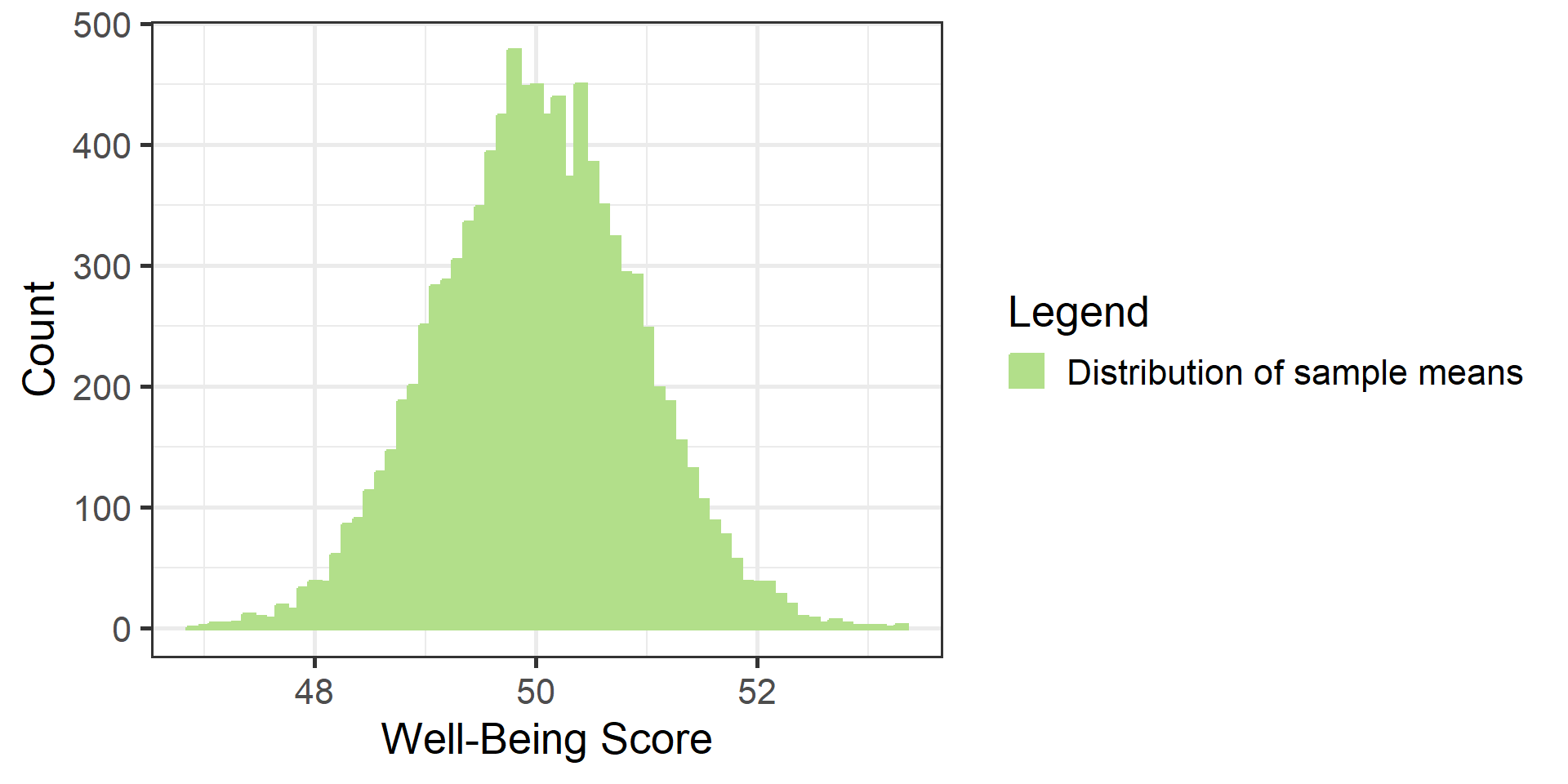
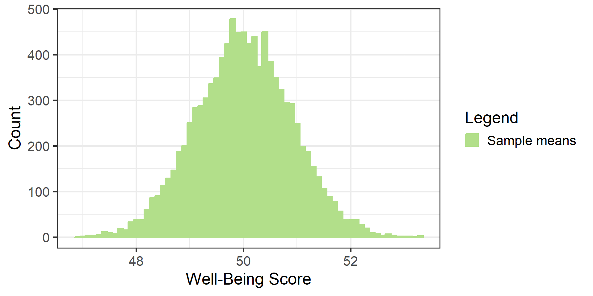
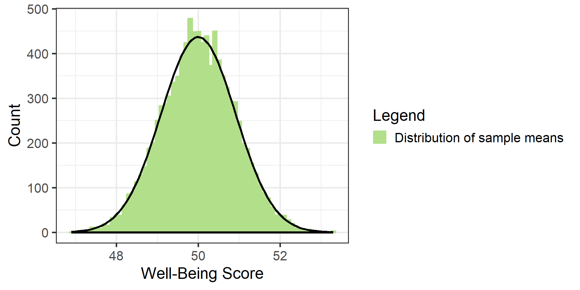
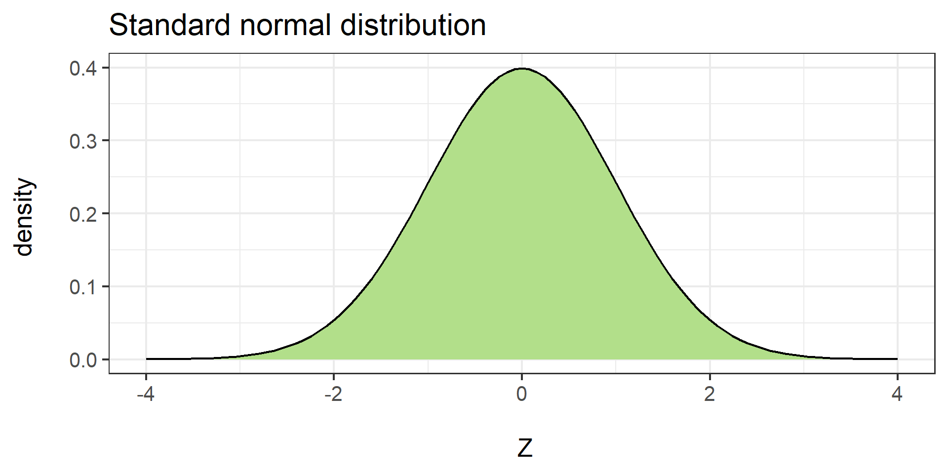
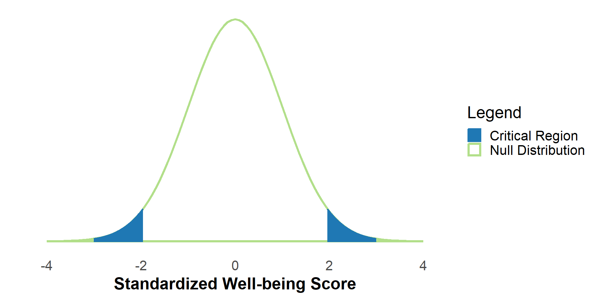
plt <- ggplot(data = data.frame(x = c(lower, upper)), aes(x)) +
stat_function(
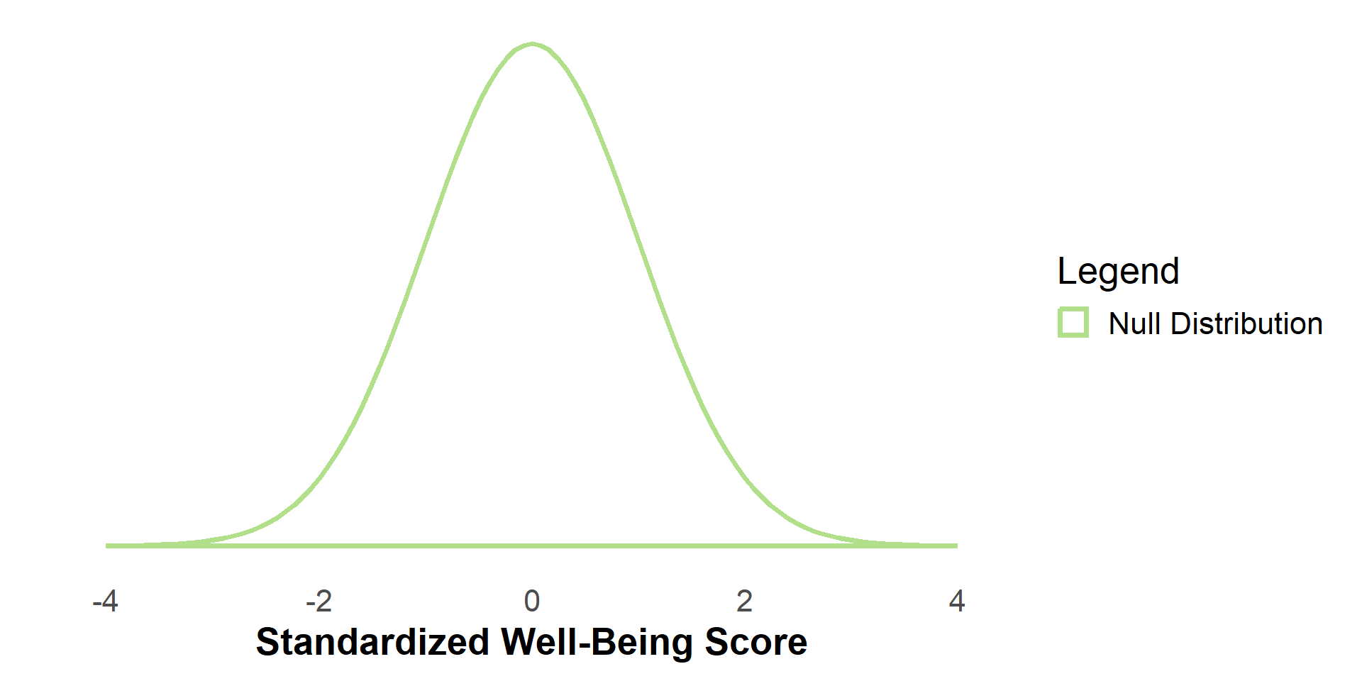
fun = dnorm, #The Null Distribution
args = list(mean = 0, sd = 1),
geom = "area",
linetype = "solid",
fill = NA,
size = 1.25,
color = "#b2df8a",
xlim = c(lower, upper)
) +
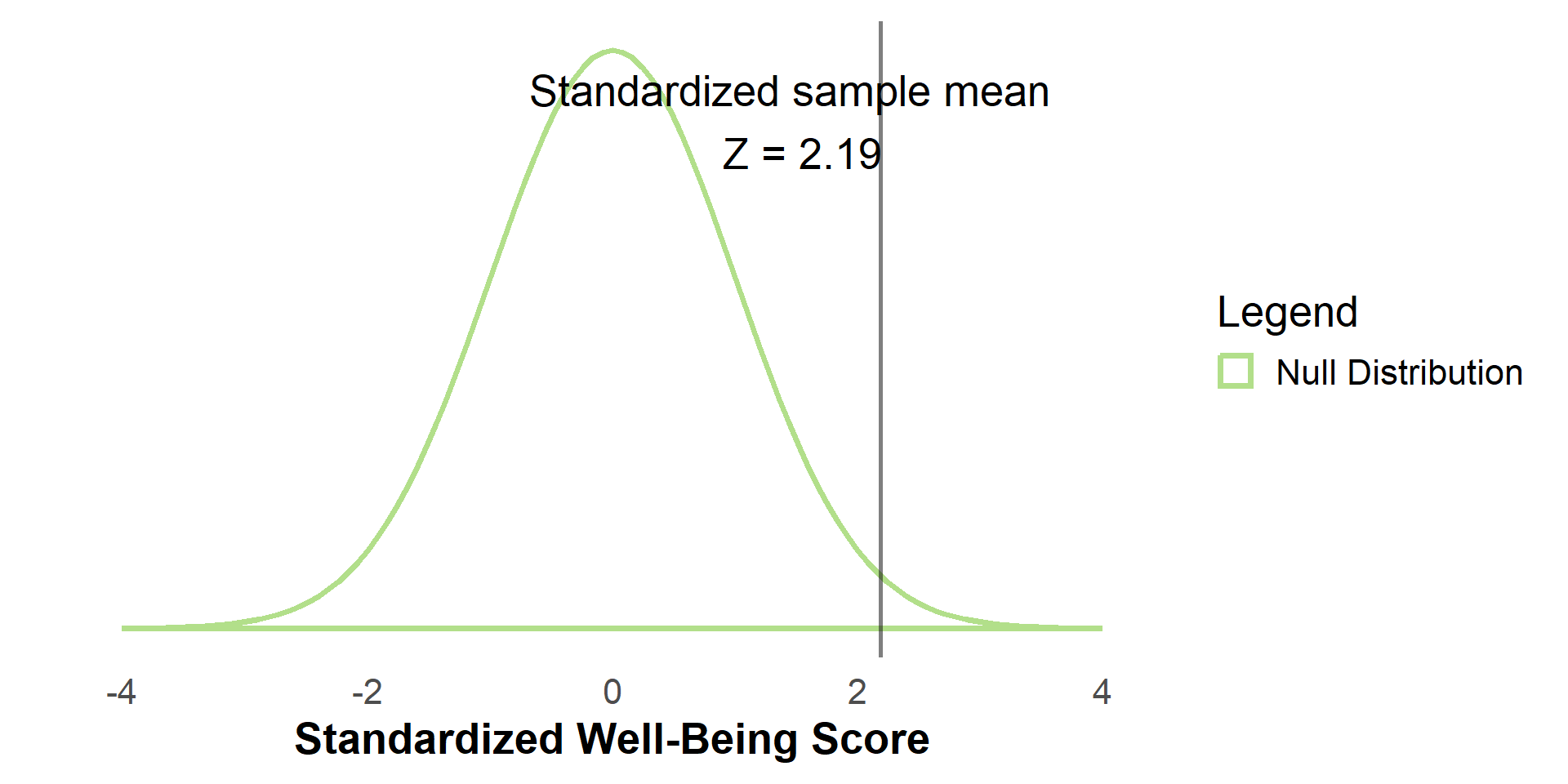
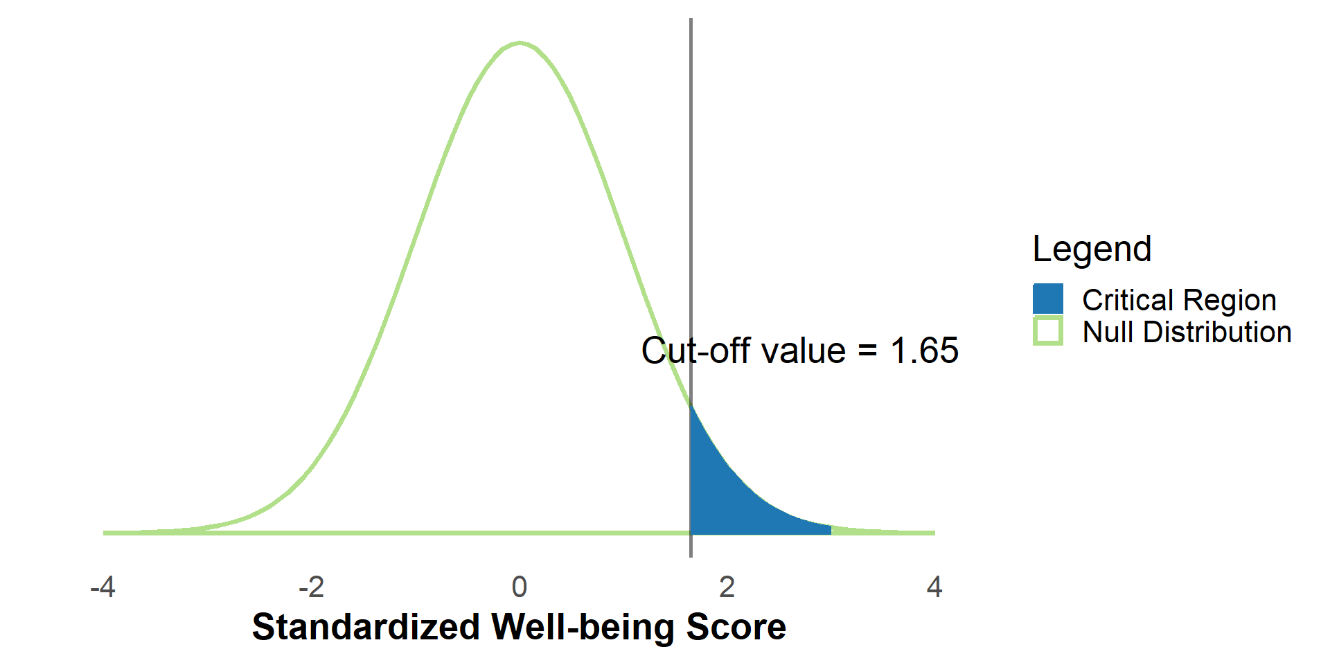
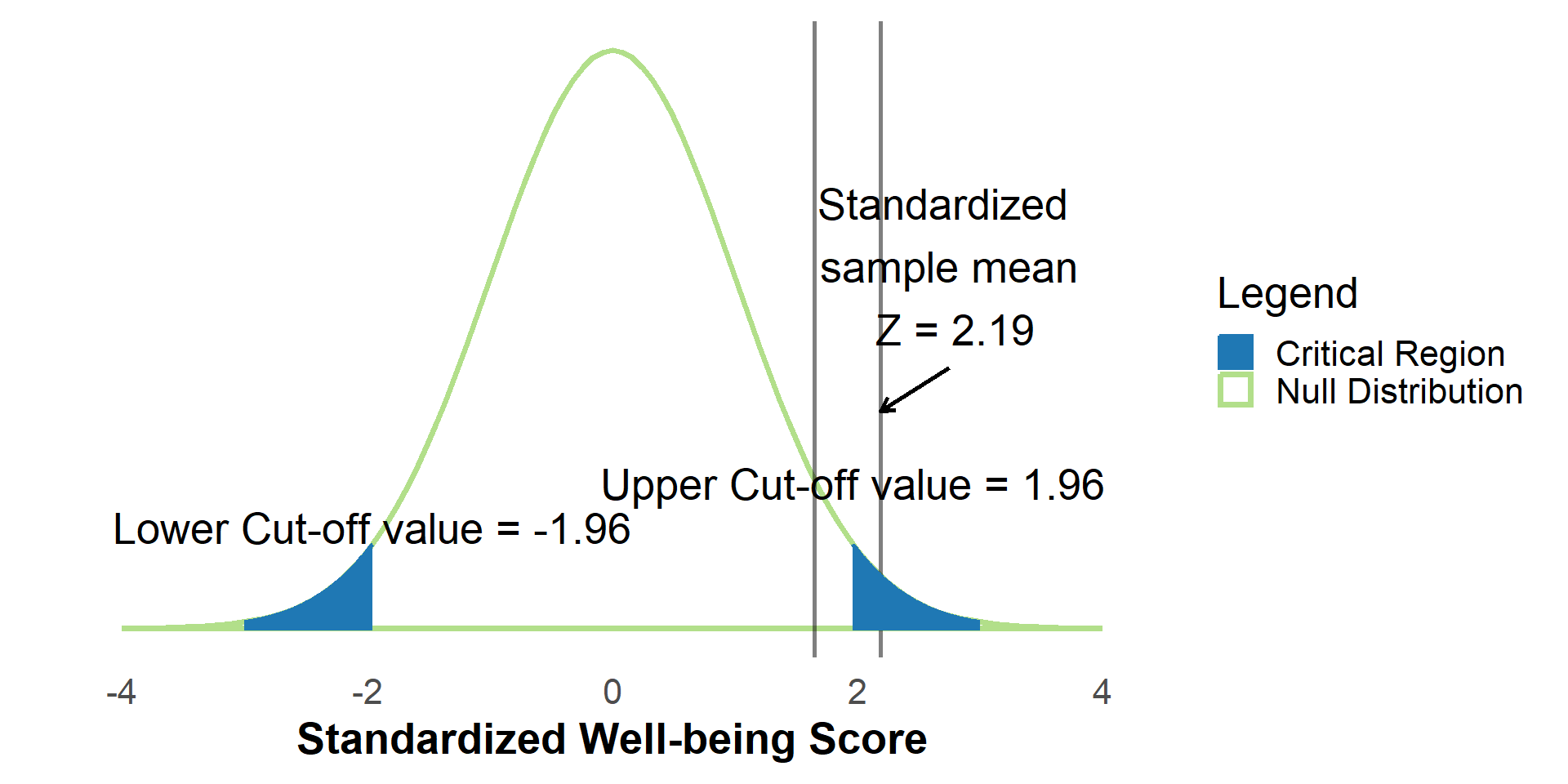
geom_vline(xintercept = input$sampleMean1, alpha = .5) +
annotate(
"text",
x = input$sampleMean1 - .5,
y = .26,
label = paste0("Standardized sample mean \n Z = ", input$sampleMean1)
)
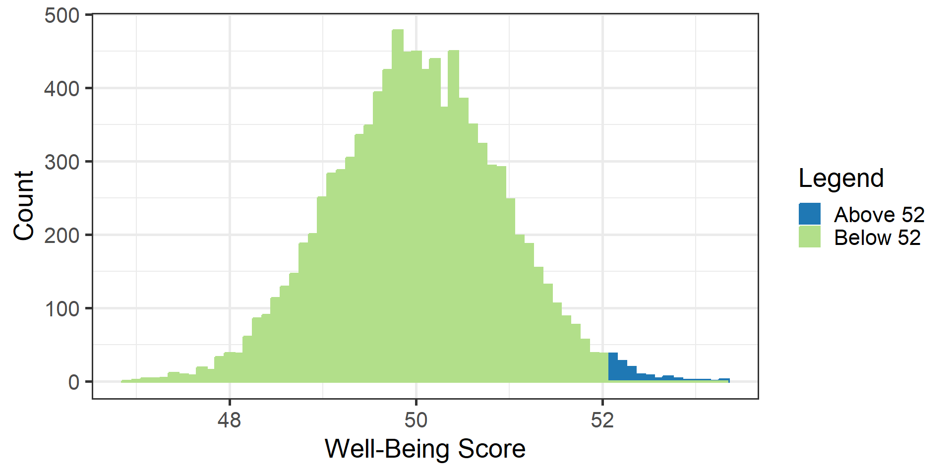
if (input$shadealpha1) {
plt <- plt +
stat_function(
fun = dnorm, # The critical region
args = list(mean = mu, sd = stdev),
geom = "area",
fill = "#1f78b4",
aes(color = "Critical Region (alpha)"),
#color="#1f78b4",
alpha = .25,
xlim = {
c(qnorm(prop, mean = 0, sd = 1, lower.tail = F), upper)
}
)
if (twotailed) {
plt <- plt +
stat_function(
fun = dnorm, # The critical region
args = list(mean = mu, sd = stdev),
geom = "area",
fill = "#1f78b4",
aes(color = "Critical Region (alpha)"),
#color="#1f78b4",
alpha = .25,
xlim = {
c(lower, qnorm(prop, mean = 0, sd = 1, lower.tail = T))
}
)
}
}
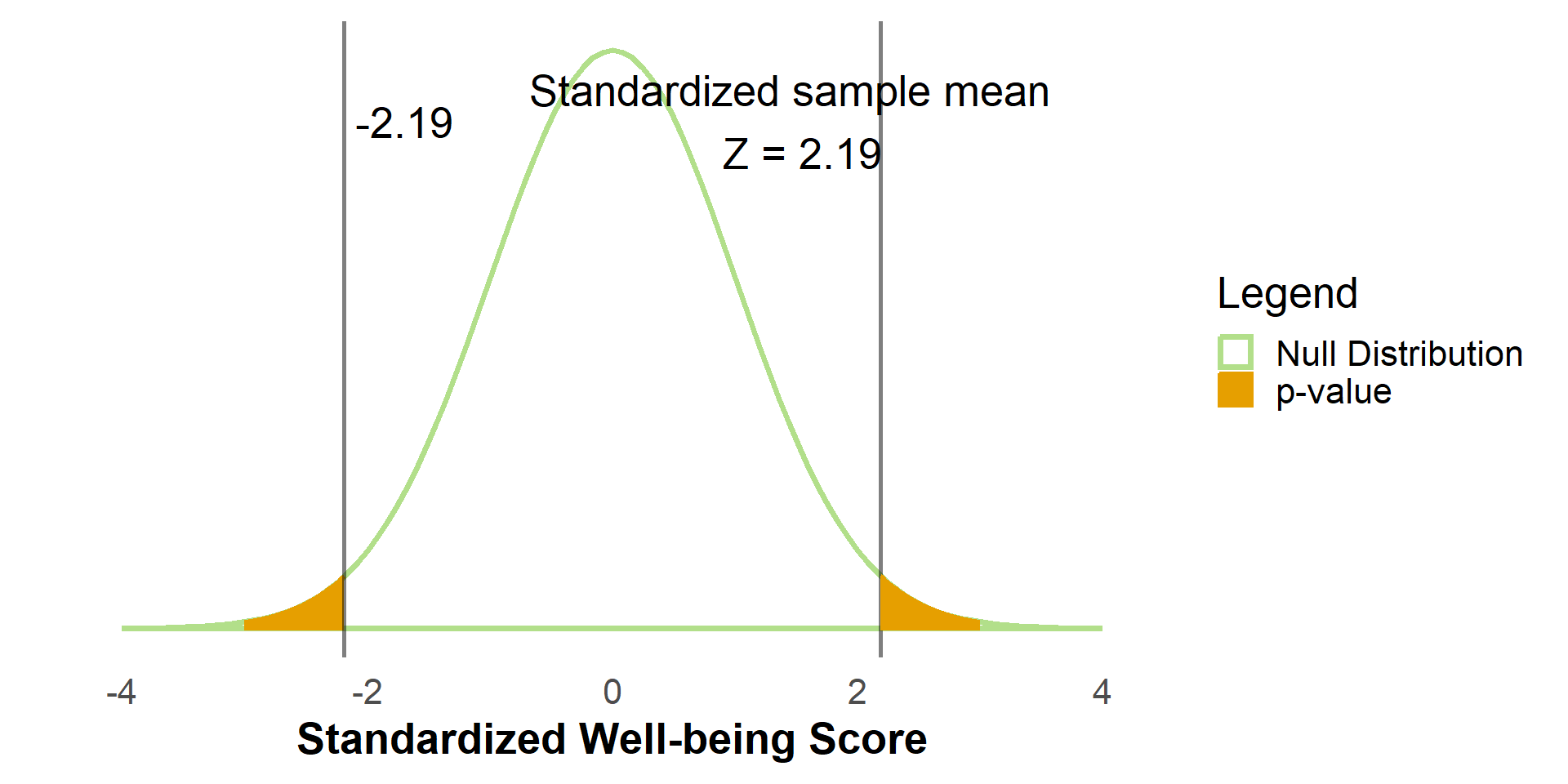
if (input$shadep1) {
if (twotailed) {
plt <- plt +
stat_function(
fun = dnorm, # The p-value
args = list(mean = 0, sd = 1),
geom = "area",
linetype = "solid",
fill = "#E69F00",
aes(color = "p-value"),
alpha = .35,
xlim = c(abs(input$sampleMean1), 3)
)
plt <- plt +
stat_function(
fun = dnorm, # The p-value
args = list(mean = 0, sd = 1),
geom = "area",
linetype = "solid",
fill = "#E69F00",
aes(color = "p-value"),
alpha = .35,
xlim = c(-3, -abs(input$sampleMean1))
)
} else {
plt <- plt +
stat_function(
fun = dnorm, # The p-value
args = list(mean = 0, sd = 1),
geom = "area",
linetype = "solid",
fill = "#E69F00",
aes(color = "p-value"),
alpha = .35,
xlim = c(input$sampleMean1, 3)
)
}
}
if (twotailed) {
obtpval <- pnorm(
abs(input$sampleMean1),
mean = mu,
sd = stdev,
lower.tail = F
) *
2
sig <- ifelse(obtpval < .05, "Significant", "Not Significant (n.s.)")
plt <- plt +
annotate(
"text",
x = 2.3,
y = .37,
label = paste0(sig, ",\n p = ", round(obtpval, 3)),
vjust = 1,
hjust = 1
)
} else {
plt <- plt +
annotate(
"text",
x = 2.3,
y = .37,
label = paste0(
if (
input$sampleMean1 > qnorm(prob, mean = 0, sd = 1, lower.tail = F)
) {
"Significant"
} else {
"Not Significant (n.s.)"
},
",\n p = ",
round(
pnorm(input$sampleMean1, mean = mu, sd = stdev, lower.tail = F),
3
)
),
vjust = 1,
hjust = 1
)
}
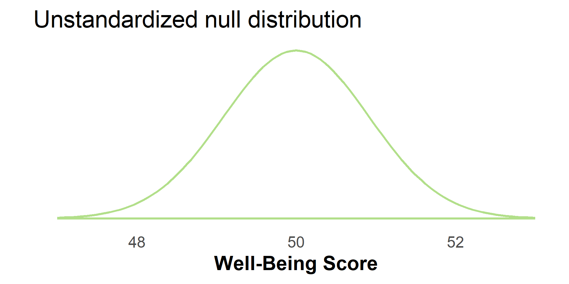
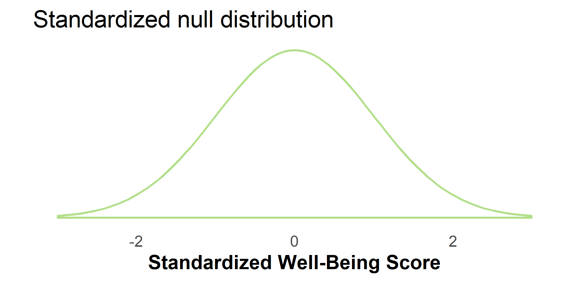
plt <- plt +
#Clears the y-axis label
ylab("") +
xlab("Well-Being Score") +
#Sets the x axis ticks to cover the whole plot
scale_x_continuous(
limits = c(lower, upper),
breaks = seq(round(lower), round(upper), by = 1)
) +
#Clears the y-axis ticks
scale_y_continuous(breaks = NULL) +
theme_minimalism()
if (input$shadep1) {
plt <- plt +
scale_colour_manual(
"Legend",
values = c(
"Null Distribution" = "#b2df8a",
"Critical Region (alpha)" = "#1f78b4",
"p-value" = "#E69F00"
)
)
} else {
plt <- plt +
scale_colour_manual(
"Legend",
values = c(
"Null Distribution" = "#b2df8a",
"Critical Region (alpha)" = "#1f78b4"
)
)
}
plt
#ggplotly(plt)
})
}
shinyApp(ui, server)